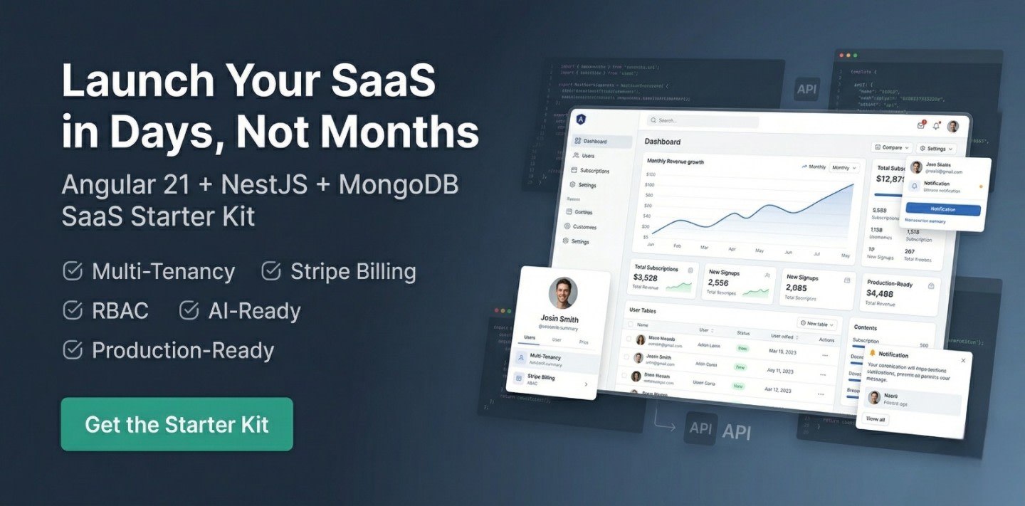
Ultimate SaaS Starter Kit (Angular 21 + NestJS + Stripe)
Ultimate SaaS Starter Kit (Angular 21 + NestJS + Stripe)
$79 $148 Save $69
Master Angular, Node.js, MongoDB & Express with real-world tutorials, SaaS boilerplates, and production-ready code — from a freelancer with 7+ years of experience.
Follow these 3 simple steps to go from zero to shipping your SaaS product.
Master Angular, Node.js & MongoDB with step-by-step tutorials built for real-world projects — not toy examples.
Explore step-by-step tutorialsFollow production-ready guides that walk you through building full SaaS features from scratch — auth, payments, APIs and more.
Follow production-ready guidesUse ready-made SaaS starter scripts to skip boilerplate and ship your product in days instead of months.
Use ready-made SaaS scriptsSkip months of development. Use battle-tested Angular & Node.js starter scripts to build and launch faster.
Ultimate SaaS Starter Kit (Angular 21 + NestJS + Stripe)
Build lightning-fast, SEO-friendly, and multilingual Angular 20+ apps with zoneless change detection and ready-to-deploy prerender setup.

Increase Customer Engagement with Advanced 3D Product Showcase Technology
Code written by the developer behind 100+ articles & 20+ projects.
Handpicked guides developers love — focused on real-world use cases and SaaS development.
New code scripts to simplify and speed up development.
Master the Instagram Basic Display API effortlessly with our ultimate guide. Boost your visibility and optimize your Instagram presence. Get started now!
Explore the best programming blogs to follow in 2026. Stay updated with coding trends, tutorials, and insights to level up your developer skills.
From Angular fundamentals to production deployments — find the topic that moves your career forward.
Angular 21, signals, SSR, lazy loading & performance tips
Modern JavaScript, ES6+, async/await, and best practices
Reactive programming with RxJS, operators, and best practices
REST APIs, Express, JWT auth, middleware & deployment
Schema design, aggregation pipelines, Atlas & indexing
Client proposals, pricing, project workflows & growth tips
Real-world Angular, Node.js & SaaS tutorials designed for developers who want to build and ship.
Learn to install and manage MongoDB, MySQL, and PostgreSQL on a VPS. Follow practical steps to optimize performance and keep your databases secure.
Set up your first VPS the right way. Follow a practical, developer-friendly guide to configure your server, improve security, and deploy apps with confidence.
Boost Angular app speed with smart lazy loading.
Jignesh Kumar
MEAN Stack Developer & Freelancer
With 7+ years of hands-on Angular & Node.js experience, I've shipped hospital management portals, production SaaS scripts, and 20+ freelance projects for clients across the globe.
TutsCoder is where I document everything I build — from Angular 21 signals to hardening a Node.js VPS. Real-world code, no fluff.
India · Remote worldwide
Join 2,000+ developers getting real-world Angular, Node.js & SaaS insights delivered every week. No spam, unsubscribe anytime.
No spam. Unsubscribe anytime.
Handpicked tools that power my daily Angular & Node.js workflow. Each one has a step-by-step tutorial right here on TutsCoder.
Free • Most Popular IDE
Essential Angular extensions pack: Angular Language Service, Prettier, ESLint, GitLens & more for a supercharged dev workflow.
Free plan available
Design UI mockups, wireframes & prototypes. Essential for dev-designer collaboration on any SaaS or client project.
Free • API Testing
Test & document REST APIs, run automated collections & mock servers. A must-have for Node.js & Express backend development.
Free 512 MB cluster
Managed cloud MongoDB with a free 512 MB cluster, auto-scaling, built-in charts, Atlas Search, and one-click backups.
Free for public repos
Automate Angular CI/CD pipelines, run tests on every PR, build Docker images & deploy to any cloud with zero config.
Open Source • Monorepo
Monorepo build system for Angular + Node.js. Intelligent caching, smart code generators, dependency graph & affected builds.
Thousands of developers use TutsCoder to learn, build, and launch faster.
The Angular starter script saved me 3 weeks of work. Auth, role management, and SSR were already set up perfectly. Absolutely worth it.
Best developer resource platform I've found. Tutorials explain things like real projects work — not just toy examples. My team uses it weekly.
Launched my freelance client's SaaS in 2 weeks using the MEAN stack scripts. The code quality is excellent — clean, well-documented, production-ready.
Affiliate-supported hosting I personally use and trust for production Angular & Node.js deployments.
High Performance Cloud
Global SSD cloud servers with 1-click Node.js apps, bare metal & Kubernetes support.
$300 free credit for new accounts
Affordable VPS Hosting
Budget-friendly VPS with managed Node.js, easy control panel & 24/7 live support.
Up to 75% off for first term
Developer-Friendly Cloud
Simple, powerful cloud with droplets, managed databases, App Platform & Kubernetes.
$200 credit for 60 days
Easy AWS Cloud
Simplified AWS for devs — predictable pricing, easy setup & access to full AWS ecosystem.
First 3 months free on select plans
Join thousands of developers who use TutsCoder to build real-world SaaS products, launch faster, and earn more.